A contribution was made for an additional template to build a portfolio.
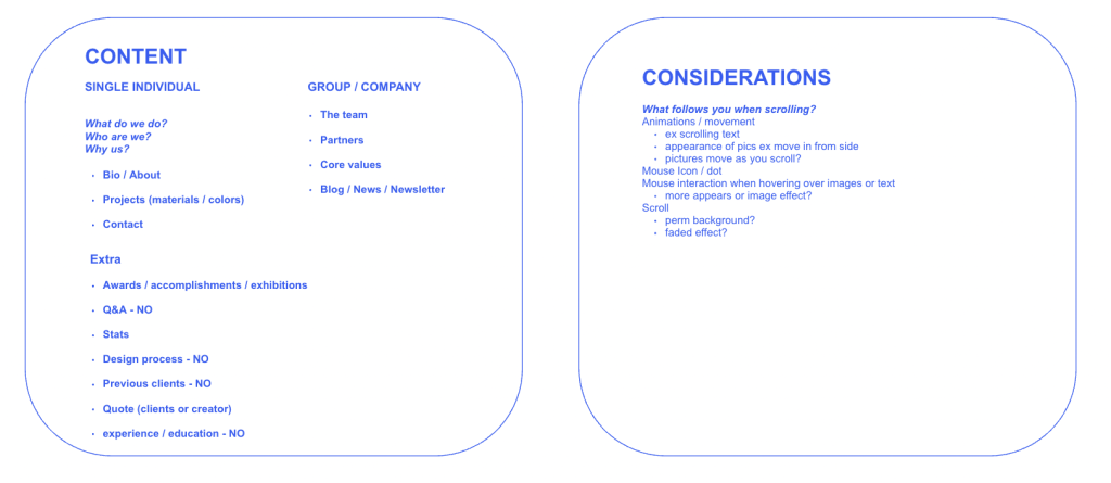
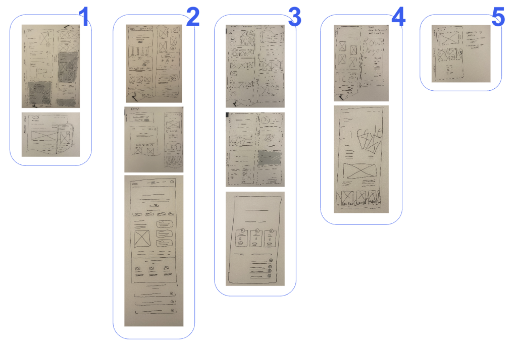
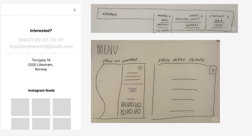
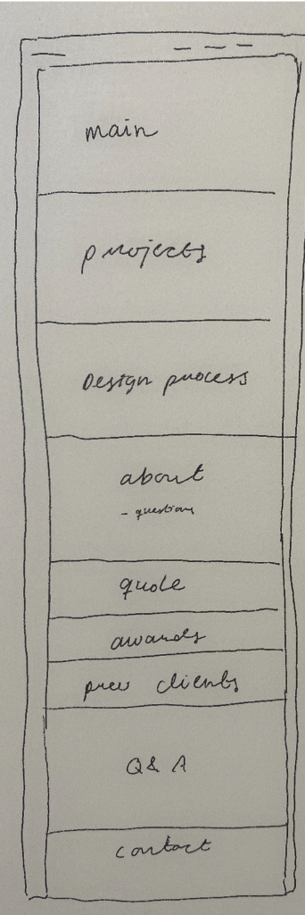
The development process began with research, as previously mentioned in other posts, and moved on to paper sketches to get a picture of what content to include, the flow of the website, as well as the design itself. It was clear a white or very light background would be complimentary to the paintings shown, as well as a simple, elegant font similar to the ones used on plagues in galleries. The menu would be simple with few elements as to maintain the simple user interface and experience. Artworks aren’t usually given much information at galleries, often to a perceiver’s annoyance as one is left attempting to understand something without any explanation. However, the aim was to resemble a gallery experience, so the presenting of information was kept to a minimum. White space was placed on both sides of the screen to replicate that of a frame so as to frame the content of the screen.