The wireframes complete, the actual coding element began. It was somewhat straight forward, however the smallest elements proved the most difficult. The community’s use of the code was kept in mind throughout as I needed to make it simple and easily understandable for others.
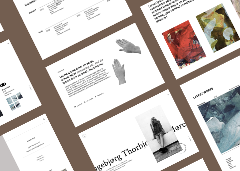
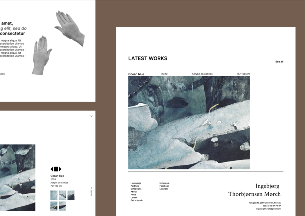
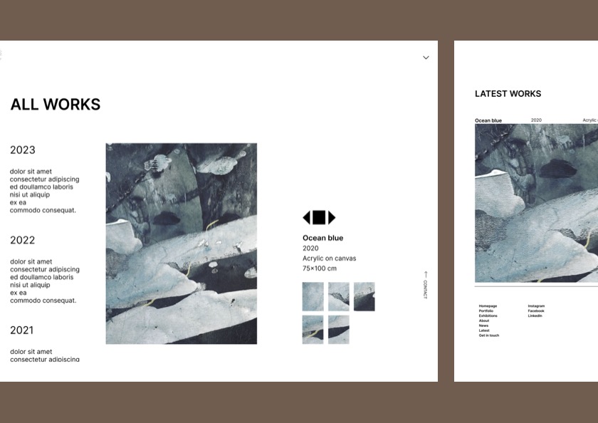
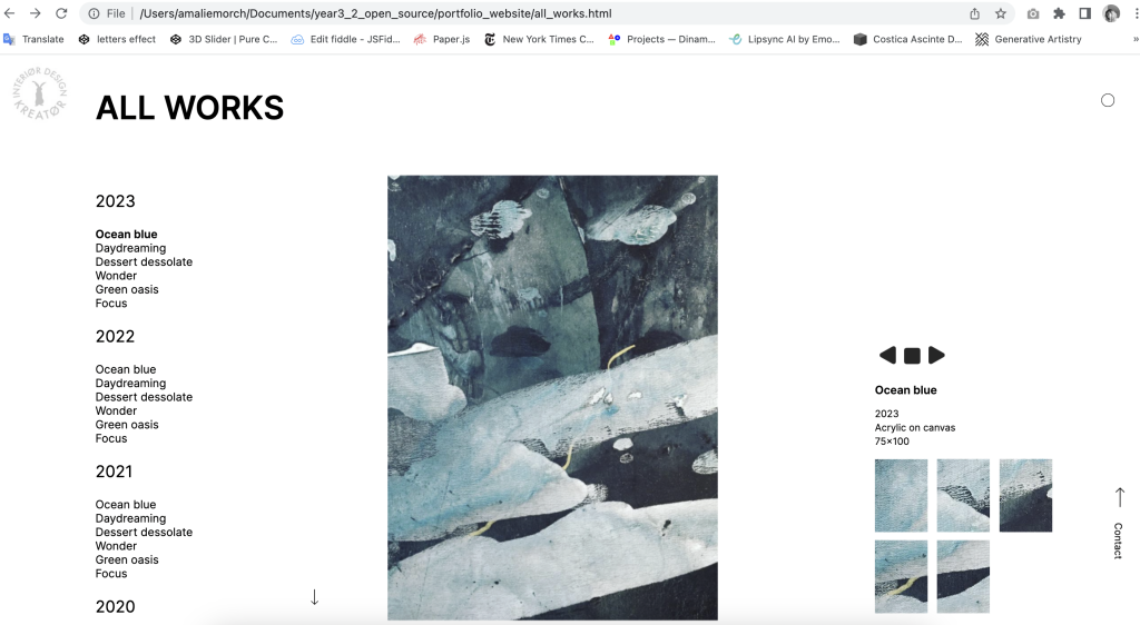
Features like animations to improve the user experience and provide more interacting elements were included. The most problematic parts of the coding was firstly the vertical menu elements by the rotation messing up the placement, at the same time as the arrow not wanting to stay on the same line as the text. Secondly, the separate page for the artworks. The separate page was to include a main picture element, as well as a small image gallery and a description of the image. It would all be linked to a list where a user clicks on a list element and the picture, description and image gallery change. This proved very difficult to implement, especially considering the use of Javascript by a developer very inexperienced in the language. Simple elements like how the first list element would be selected when entering the page, or to not show all of the gallery images at ones, were challenging. There were originally going to be two arrows for the user to have an optional way to navigate between artworks, however the linking of the arrows to the small image gallery proved unnecessarily difficulty, even though they linked just fine to the description and main image. The arrows were therefore removed as it wasn’t an important element but rather an additional way to navigate between artworks.
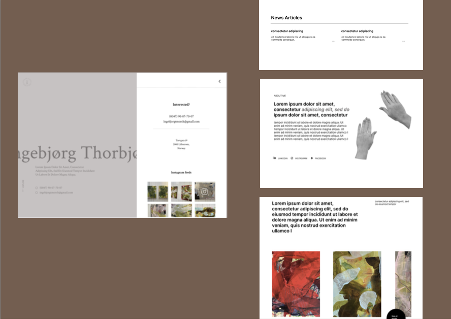
One of the last things considered in the coding process was the inclusion of an Instagram API to update the instagram posts in the slide out menu automatically. It however seemed like a complementary element and not necessarily important. It was therefore decided to rather include it as a possible addition if a user in the community wanted to implement it themselves. A further improvement would also be to include sectioning on the separate artwork page if an artist has different mediums or styles of creation.
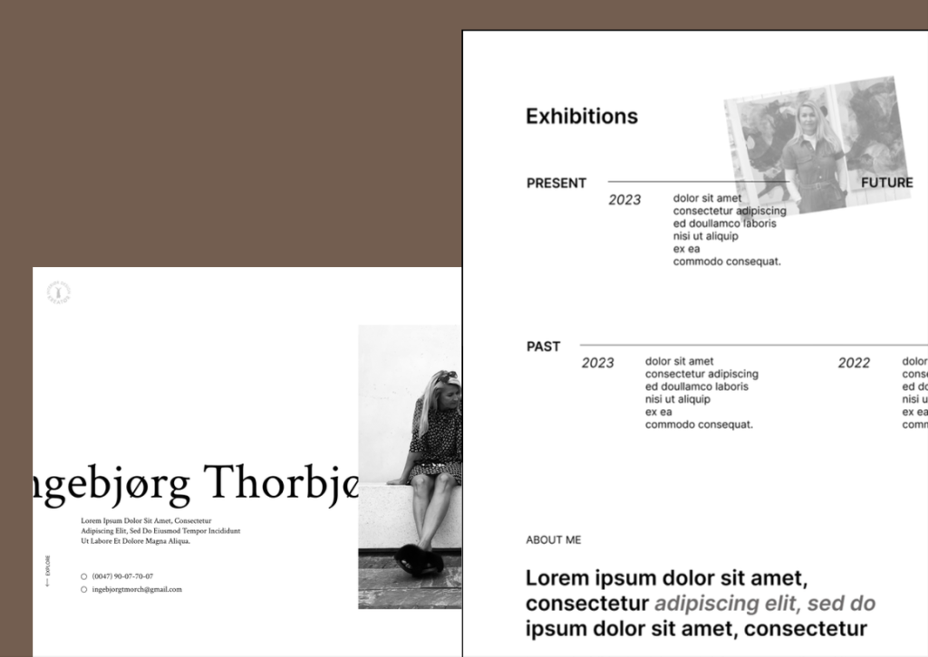
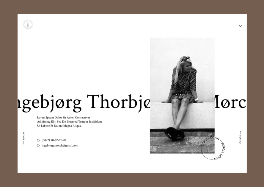
Websites usually have mobile formats to view the content on both laptops and mobiles, yet it was decided to exclude this option and rather have an alert pop up when a user tries to view the portfolio on a phone. This decision was made to give the artist a proper viewing space and credit to their work. The artwork wouldn’t be presented in the best way if viewed on a phone, taking something away from the whole impression. To properly experience the portfolio and the work it presents, the portfolio is to be viewed on a bigger screen. It takes away a user’s option to view the work and might make it troublesome for some. Yet admiring art at a gallery is a different experience from viewing it in a bought book. It requires effort yet ultimately leads to a better experience. The aim was to give the artwork the best possible gallery space.
Commenting the code was the last thing done to make the code easily understood by users. Everything was segmented and indented to provide clean and readable code as users may not have much previous coding experience.